Matplotlib Histograms - From Lame to Pro
How to create awesome Histograms with Python
I love Histograms and I love Matplolib, so let’s combine them.
In this post, we will go through the code of a dynamic histogram that doesn’t make you puke if you look at it.
Recreate
Every time I create a plot I like to use some references. I steal a style and apply that to my data.
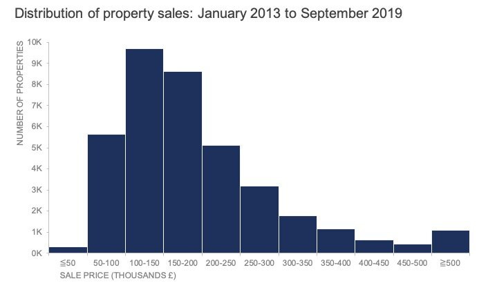
Now, I used the histogram from this awesome post by Storytelling With Data.
What I most like about this is the X-axis. The labels show the bins and the edge bins use smaller/larger signs to show the edge cases. We can already tell a story like this: “It’s rare for a property to sell below £50K.”
Awesome visual, worth stealing!
The starting point
I used the 650 FIFA 22 Players Dataset from Kaggle, and we will look at the player's height.
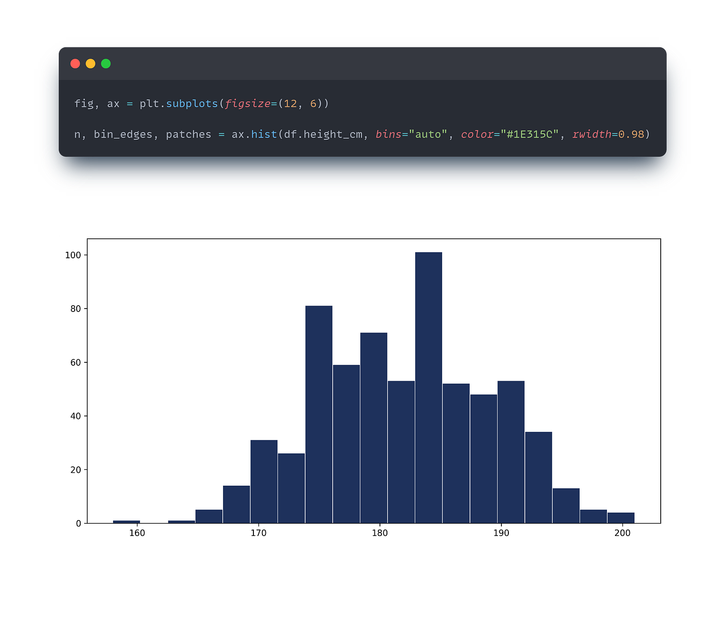
Matplotlib is awesome for creating fast visuals. In 10 seconds you can understand the data better by drawing a quick histogram like below. The only problem: It’s ugly as hell, don’t show it to anyone!
If we want to show it to someone we need a lot of modification!
Good news, Matplotlib can do that too!
I like to break the process down into smaller tasks. Here is what we need to do:
Get rid of the grid
Remove spines
Add axis labels
Create dynamic bin labels
Adjust style here and there
As an extra step, we will also add dynamic data labels to the top of the bars
Step 1
We set the stage with the first line.
fig, ax represent the figure and the axes objects. fig is the container for everything we see and ax can be used to manipulate the axes level properties of the plot.
plt.subplots() creates the plot itself and we set the size with figsize=(12, 6) , the figure is 12 inches wide and 6 inches tall.
Matplotlib histograms return 3 values.
nis an array containing the number of occurrences in each binbin_edgesis an array of bin edge locations—these values define the edges of the binspatchescontains the bars of the histogram
ax.hist() creates the histogram. In this, we define the data, how we bin the data, the color of the bars, and the width of the bars.
The "auto" option lets the algorithm decide the appropriate bin width and number of bins.
We can use numbers here, or other predefined methods to calculate bins, but more on that in another post.
In histograms, we generally have no gaps between the bars to indicate continuity in the data, but since now I copy I added a little gap by making the bar widths smaller.
The grid disappeared, but we can use ax.grid(False) to remove it if necessary.
Step 2
ax.spines[['top', 'right']].set_visible(False) - I think this line should be default! With this we remove the ugly box around our chart (at least the top and right side).
The 2nd and 3rd lines make the X and Y axes and ticks thinner.
Then I added the labels and title and located them.
Note: Here I added some dynamic elements by using f-string for the title.
Step 3
Here comes the fun part! We need to make the dynamic bin labels.
First I calculated the centers of the bins so I could place the the labels correctly.
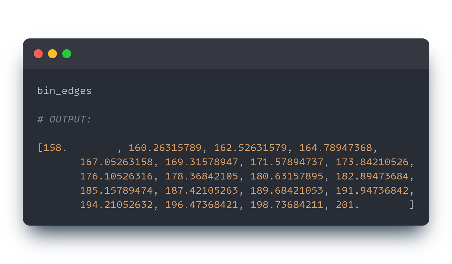
It may be easier to understand what happens in the background if we take a look at bin_edges:
The first line does the following:
Takes the difference between the edge values (basically we get the width of the bars):
np.diff(bin_edges)Halve this value:
0.5 * np.diff(bin_edges)Add this value to the beginning of the edges.
We have the positions, now we need the labels.
As I mentioned before, the reference chart uses some special characters (> and <) to handle the two ends of the chart.
First and last labels
[f"< {bin_edges[1].astype(int)}"] creates the first label. It uses the second bin value and converts it into an integer. (Our data is in integers as well) and we add the < sign with f-string.
labels += [f"{bin_edges[-2].astype(int)+1} +"] The last label is created similarly to the first, but I used the + sign to indicate greater than or equal to.
Middle labels
labels += [f"{bin_edges[i].astype(int)+1} - {bin_edges[i + 1].astype(int)}" for i in range(1, len(bin_edges) - 2)]
In the middle, list comprehension was used to go through the elements.
Since Matplotlib histograms are half open (the end of the edge is not included in the current bin), I added 1 to the current iteration. You can see on the chart that there is no overlap in the bins. The iteration starts from the second bin edge and stops at the second-to-last.
Final touches
Here is the result:
The reference table didn’t contain the frequencies, but we can easily add it, so why not? ax.bar_label(patches) will do the job.
I also added the calculation method into the title, since it is easier to understand now. (I would remove it in presentations of course).
By modifying the numbin variable, we can change our result.
Here are two variations with 5 and 10 bins:
The whole chart is dynamic. The only modification was made in the numbin variable.
You can find the code here, or check out my entire notebook on this link.
fig, ax = plt.subplots(figsize=(12, 6))

numbin=10

n, bin_edges, patches = ax.hist(df.height_cm, bins=numbin, color="#1E315C", rwidth=0.98)

ax.spines[['top', 'right']].set_visible(False)
ax.spines[['left', 'bottom']].set_linewidth(0.2)
ax.tick_params(which='both', width=0.2)

# Labels and title:

ax.set_ylabel('Number of players', loc='top')
ax.set_xlabel('Height of players (cm)', loc="left")
ax.set_title(f"Distribution of top {len(df.height_cm)} FIFA Player's Heights - {numbin} bins" , loc="left", fontsize=14)

# the bin labels:
bin_centers = 0.5 * np.diff(bin_edges) + bin_edges[:-1]

labels = [f"< {bin_edges[1].astype(int)}"]  # The first label
labels += [f"{bin_edges[i].astype(int)+1} - {bin_edges[i + 1].astype(int)}" for i in range(1, len(bin_edges) - 2)]
labels += [f"{bin_edges[-2].astype(int)+1} +"] # The last label

ax.set_xticks(bin_centers, labels, rotation=45)

ax.bar_label(patches);
So, this is how I create dynamic histograms!
Let me know what you think about this approach!


