

The CLEAR Method for Visualization
Matt Harrison's Method for Effective Visuals

Visualizations are the most creative field in data, but we usually associate “creative” with “fancy.” Visualizations should not be fancy; they should be simple and clear and tell a great story.
In his new book, Effective Visualization, Matt Harrison discusses the CLEAR framework to make effective visuals that serve the purposes above. CLEAR stands for:
C - Color
L - Limits
E - Explanation
A - Audience
R - References
Color
Color is the biggest asset for visualization. You can define/change a lot of things with it.
The best use of color is to guide the eye of the viewer. You can emphasize your story by graying out the “everything else” and keeping the most important points colorful.

We can also use colors based on already existing associations. For example, we tend to attach blue to cold and red to warm. Red is bad, Green is good, and so on.
Matt suggests using 3 colors maximum. More can be overwhelming. Also, you need to think about colorblind people and how the chart will look in black and white or grayscale.
Limits
As a beginner, I wanted to create the fanciest visuals ever. I thought infographics that have a bunch of data on them were cool. But now I understand that the simpler, the better. Limits give you simplicity. Again, we are aiming for story, not art.
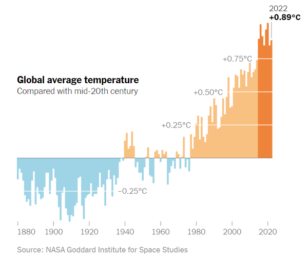
You should use the most basic charts like line plots, bar plots, scatter plots, and histograms. The audience will be familiar with these chart types, and familiarity makes understanding easier. For a new, fancy chart, they need to understand how the chart works first, then the story.
A simple visual like the above is easy to understand; it takes 3 seconds. But what happened here is a crime:
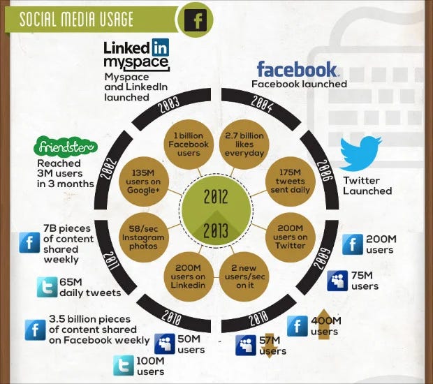
Your eyes are probably jumping around, trying to figure out where to look, and you get frustrated after 15 seconds of looking at the “visualization”.
There are no hard rules here. Remove unnecessary things where possible, but there is no problem with adding labels if you need them to tell the story.
Two plots are better than one crowded plot! Creating more visuals is ok until you keep them simple and they add to the story. Sometimes, it’s impossible to pack everything into one visual.
Use complex or novel charts only when absolutely necessary. There is no issue with coming up with new ideas, but keep it simple and consider understandability.
Explanation
Sometimes, the visual itself is enough to get the point, but titles, subtitles, legends, and labels can help.
Colors guide the eye, text guides the understanding. The shorter, the better; they can even be words, not whole sentences.
Consider the placement of your annotations. They should be close to the data they explain. Colors for text can be applied here as well, but stay within the limits mentioned above.
Arrows, circles, and callout values are other visual elements that can help with the exxpanation.
Audience
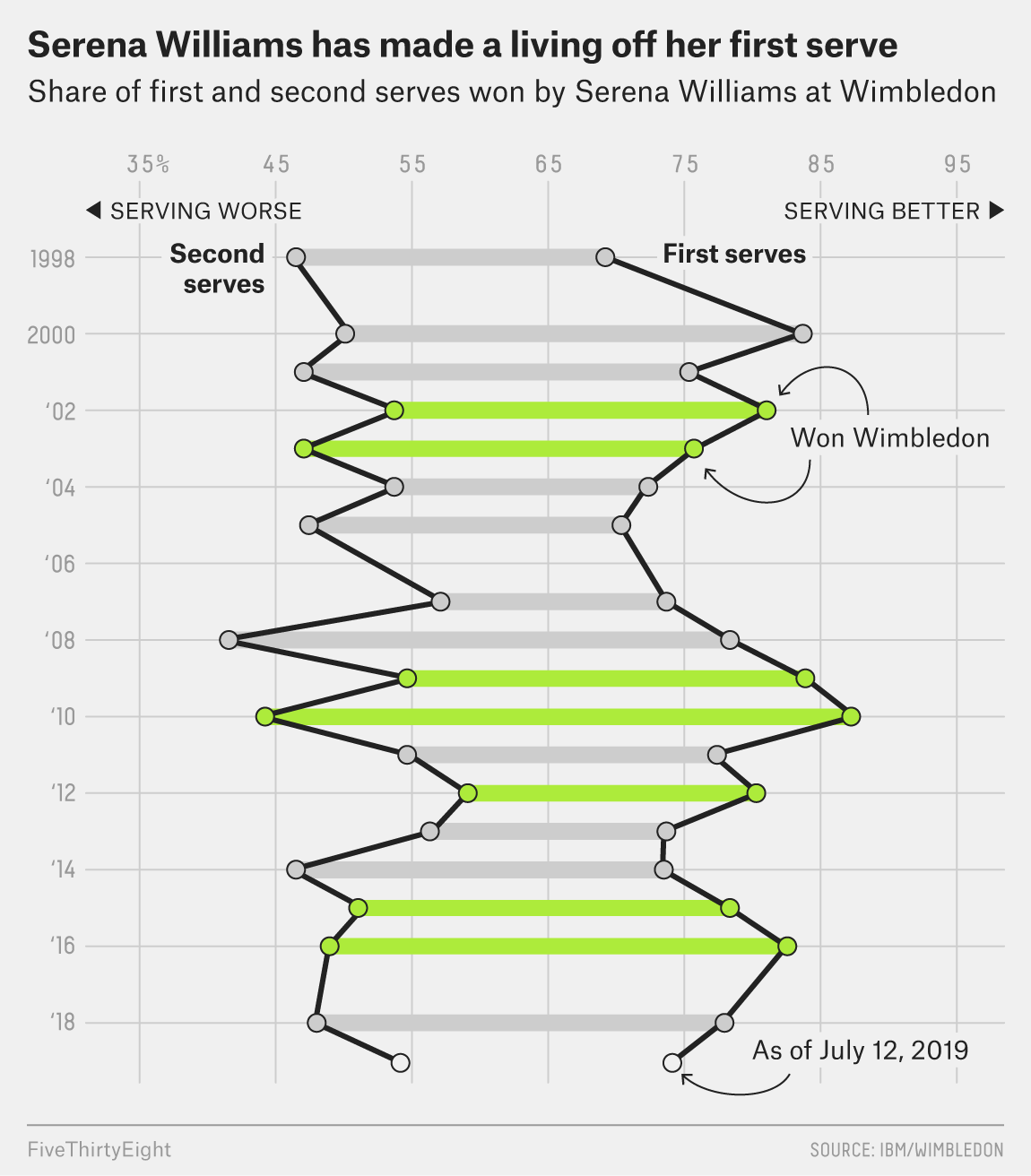
Knowing the audience is a must. You will not use jargon or niche words if you know that the audience cannot understand them. The sport chart above is kind of niche since someone not familiar with Tennis may have a hard time understanding it.
If you create visuals for a wide audience, keep your wording on grandma’s level. Simple always win like Serena Williams did.
You can use the same dataset to create different stories for different audiences. The sales team may be interested in revenue trends, while HR requires a story on salaries.
References
Cite the source! Tell the data source and what types of modifications you made to it.
By linking the source, you allow others to work on the same data. This is key for replicating the analysis or even improving it.
Where to find good examples?
FiveThrirtyEight collects its best charts every year. Here is the 2019 edition (Good examples in this post are from these collections)
Other big news sites like the NY Times and The Economist have awesome charts that follow the most important rules. Use these as inspiration and learn from their great visuals!
Sources:
Effective Visualization: Exploiting Matplotlib & Pandas by Matt Harrison
https://fivethirtyeight.com/features/our-51-best-and-weirdest-charts-of-2021/
https://fivethirtyeight.com/features/the-56-best-and-weirdest-charts-we-made-in-2019/
https://visme.co/blog/bad-infographics/